
CHICKEN SNACK
An editorial voice cast in ink, paper and pace.
Role
Print & Branding Identity
Client
CHICKEN SNACK
Timeline
Sep — Dec 2025
Tools
Illustrator · Photoshop
/ Creative Process
The brief.
The solution.
01 — Context
The brief.
CHICKEN SNACK is a well-established household name and one of Sofia’s premier spots for iconic döners and chicken snacks. Having built a loyal community through exceptional quality, they needed a complete visual identity makeover to modernize their brand image, reflect their top-tier status, and stand out in the evolving urban food scene.
02 — Strategy
The solution.
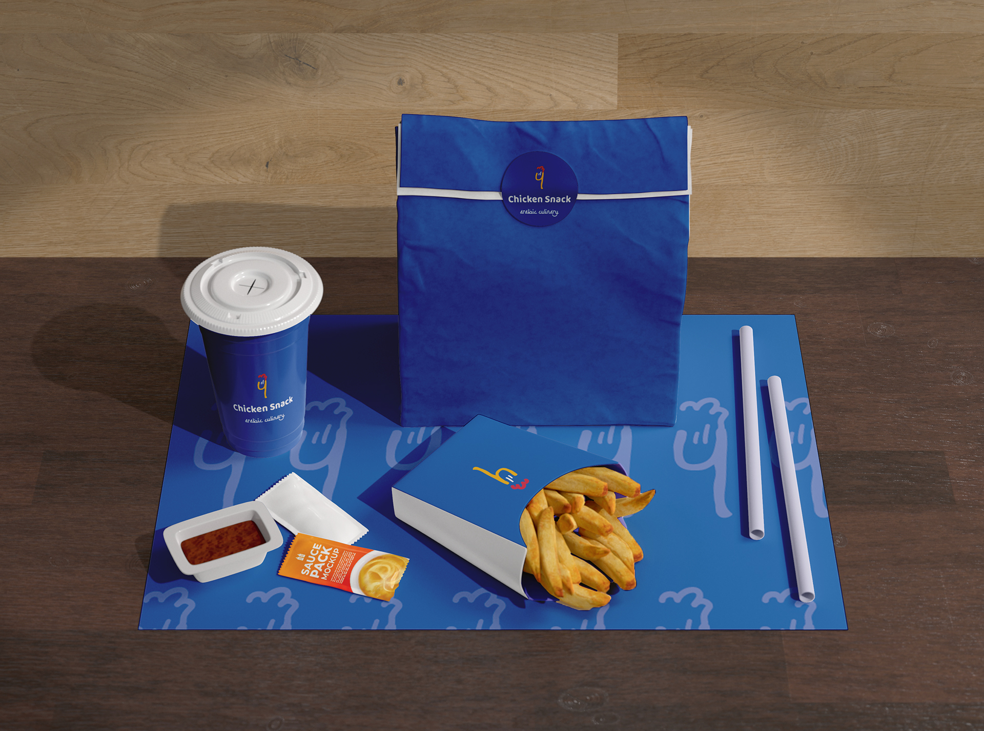
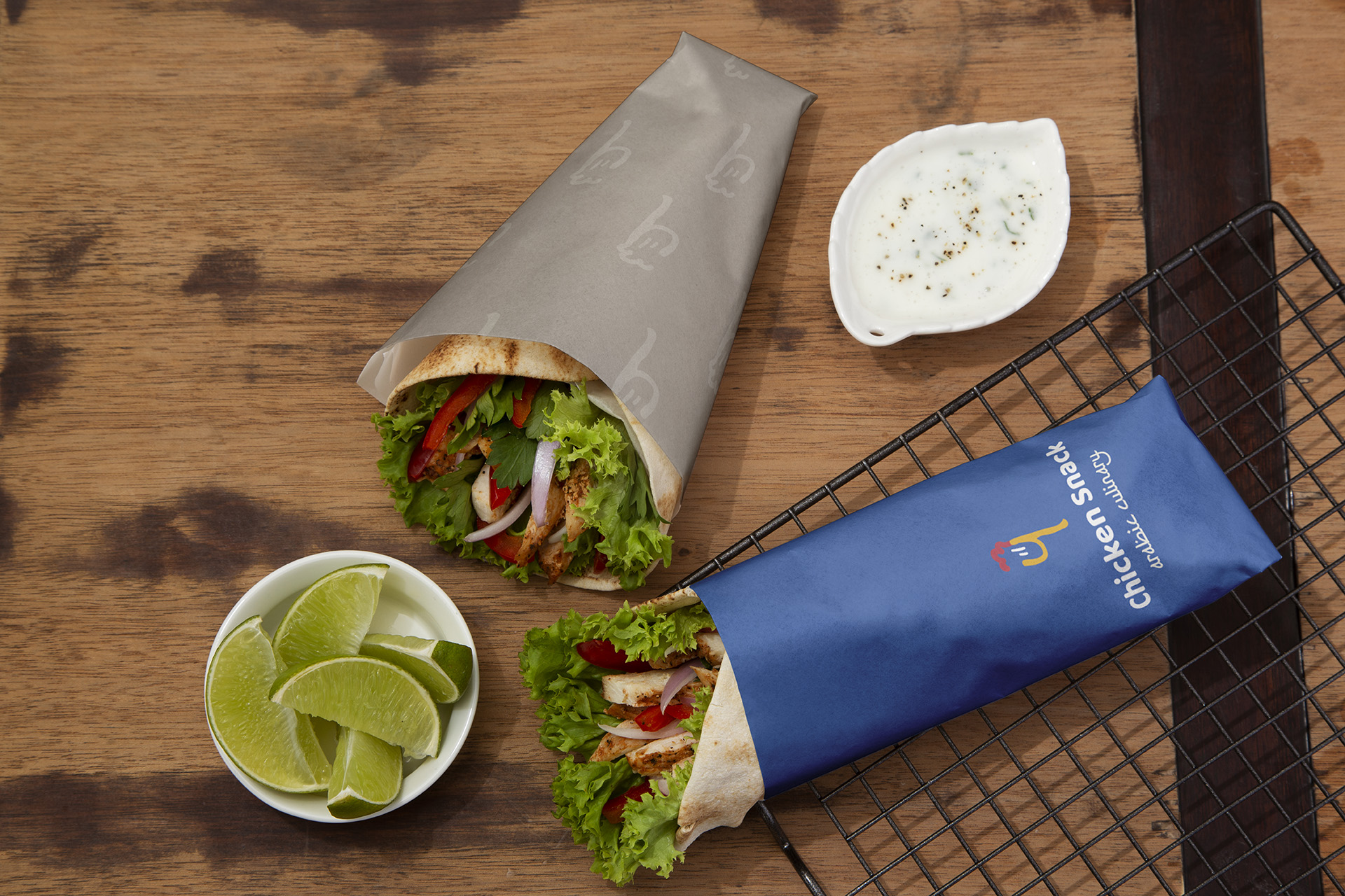
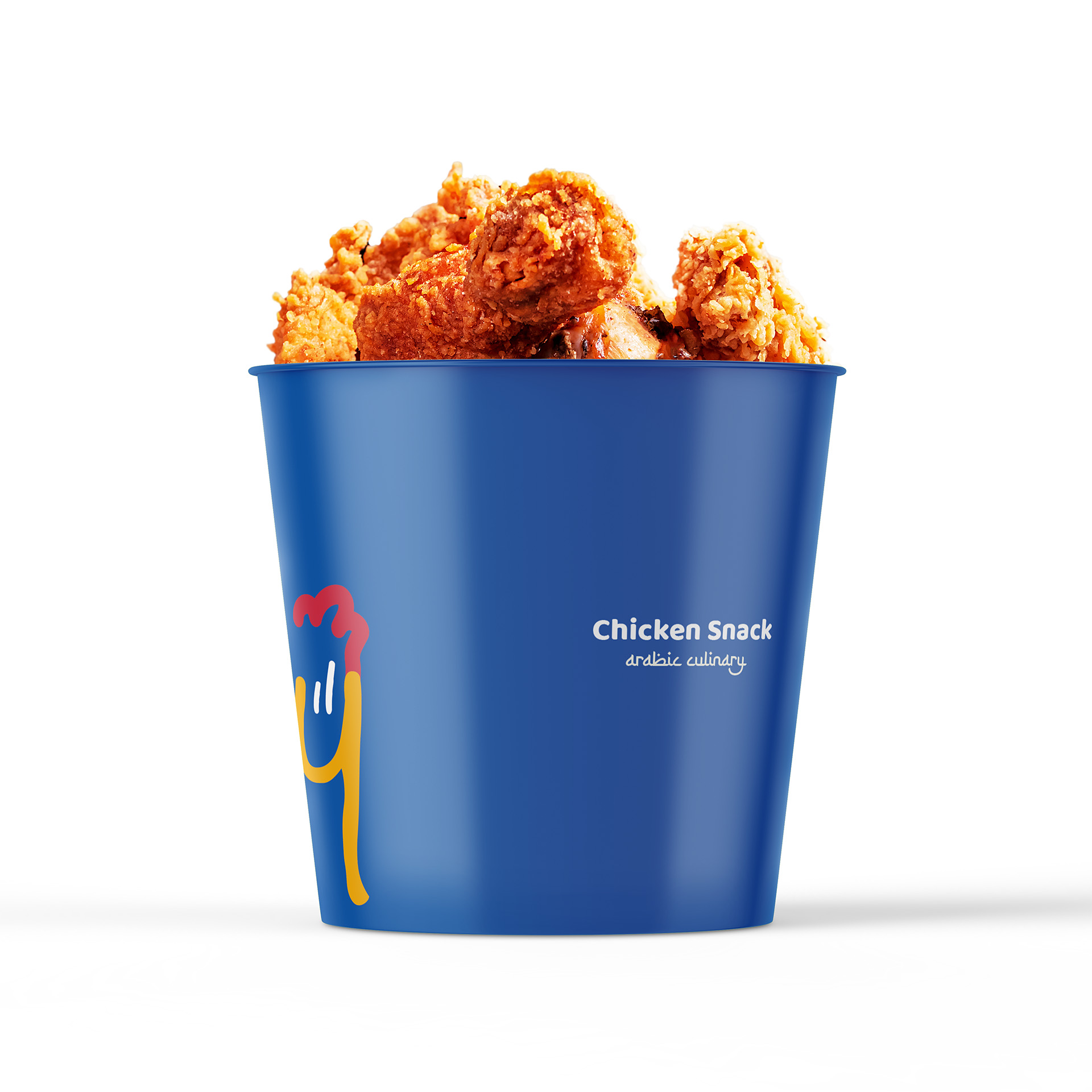
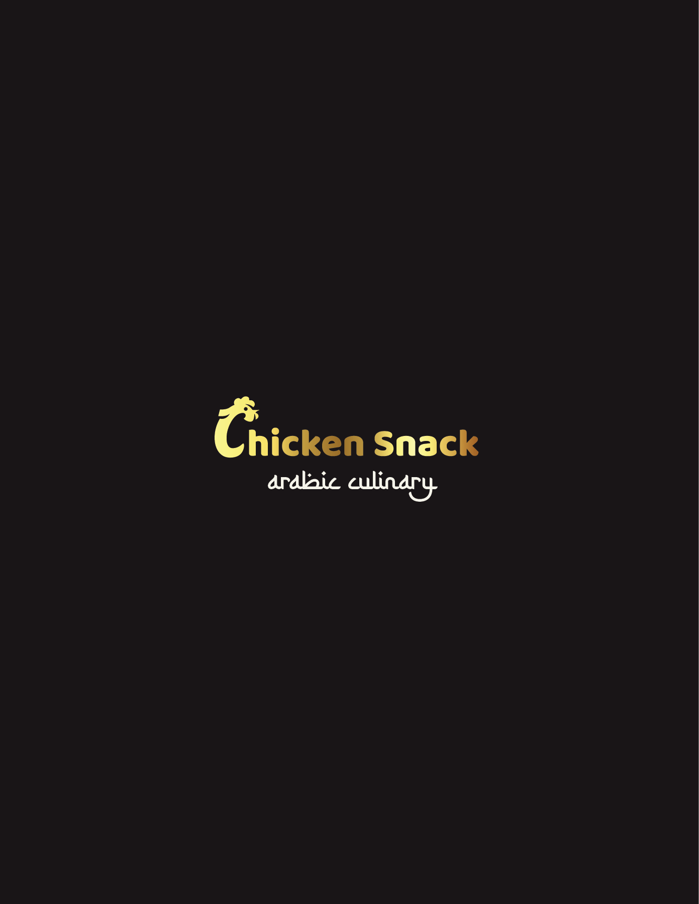
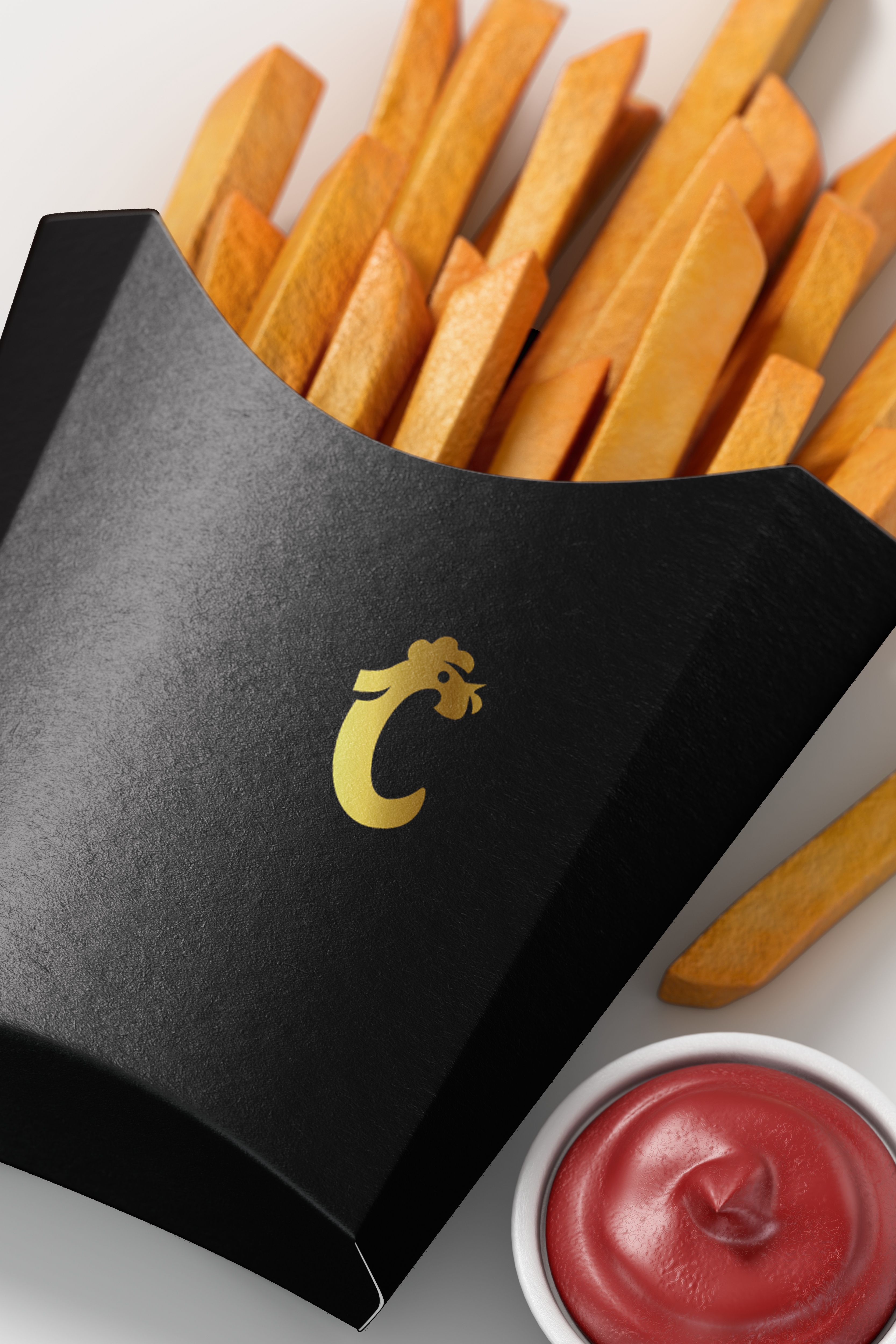
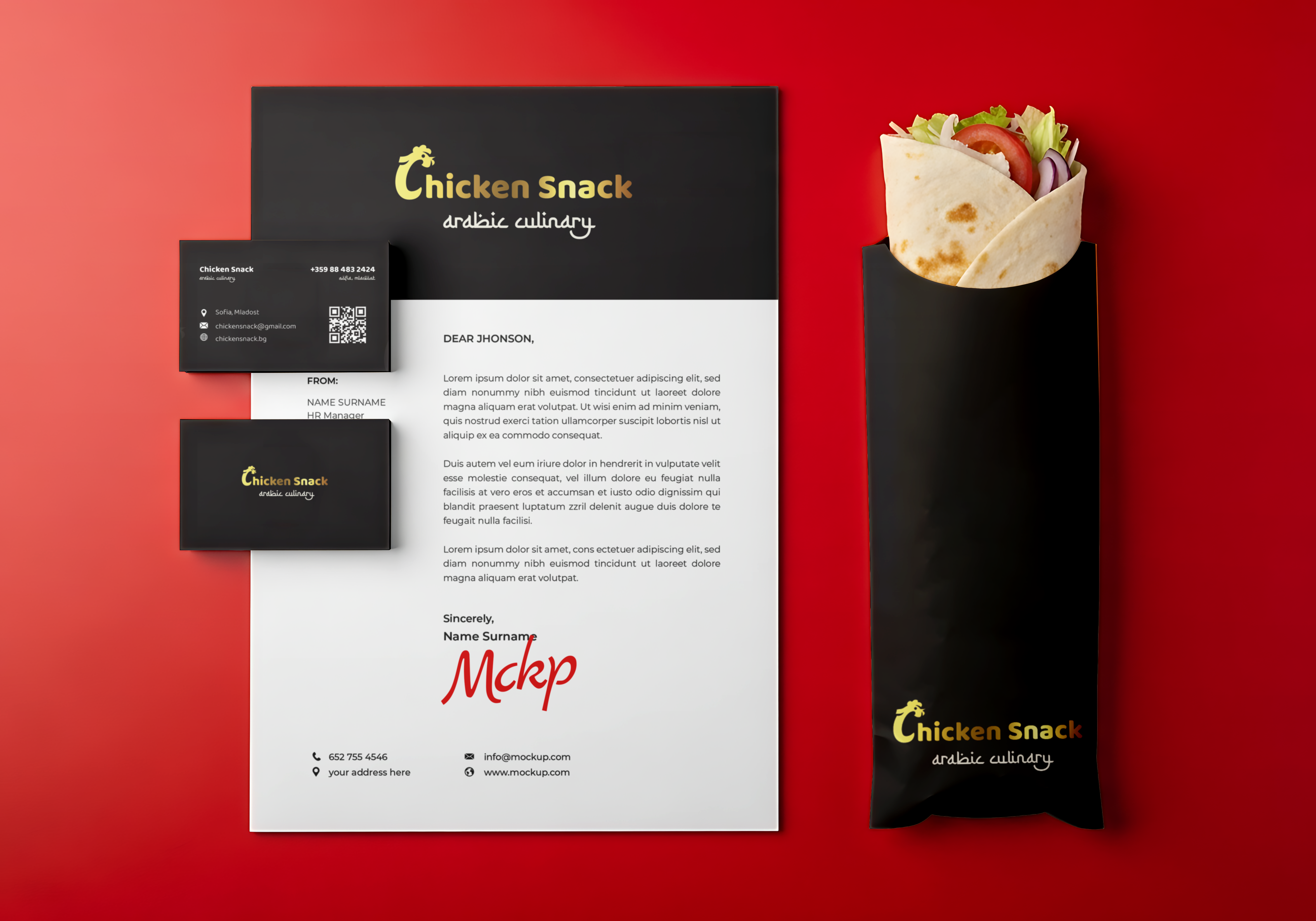
We explored two distinct logo marks and brand direction routes, ultimately selecting a sleek, black-dominated identity system. Driven by high-contrast typography and dynamic graphic elements, the chosen black aesthetic shifts CHICKEN SNACK away from fast-food clichés, delivering a bold, premium street-style look that commands the urban landscape.
/ Visual Showcase
The
presentation.
/ Next Project
Fiore Naturale
BRAND IDENTITY · 2021