
FIORE NATURALE
An editorial voice cast in ink, paper and pace.
Role
Logo & Branding
Client
Fiore Naturale
Timeline
May — Oct 2021
Tools
Figma · Illustrator · Photoshop
/ Creative Process
The brief.
The solution.
01 — Context
The brief.
Crafted from pure botanical extracts, the brand offers high-grade essential oils designed for holistic well-being. They had an exceptional, sustainably sourced product line — but lacked a refined visual identity and a seamless e-commerce website to translate their natural essence into a compelling digital brand experience.
02 — Strategy
The solution.
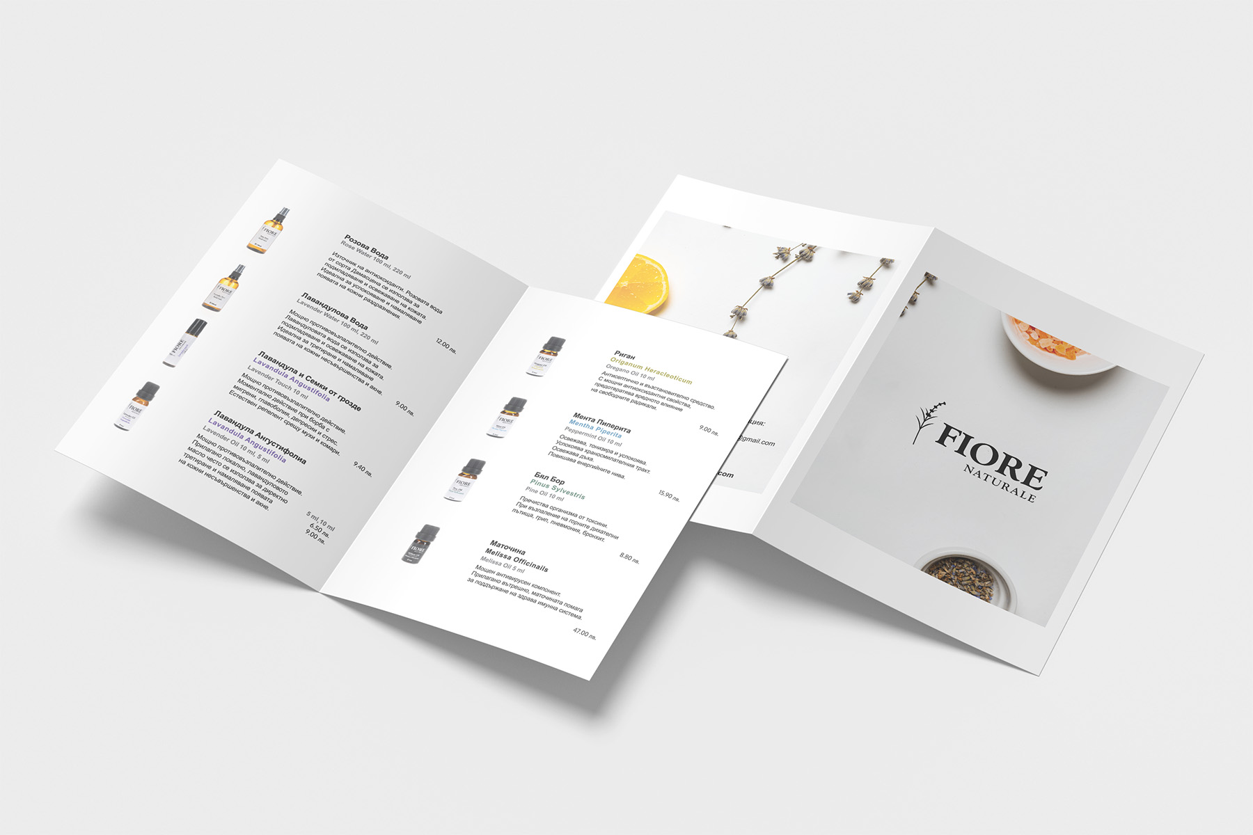
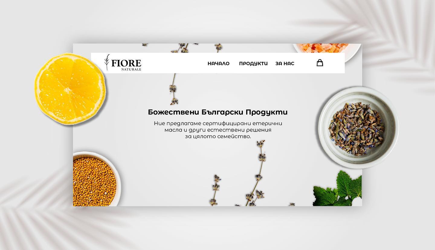
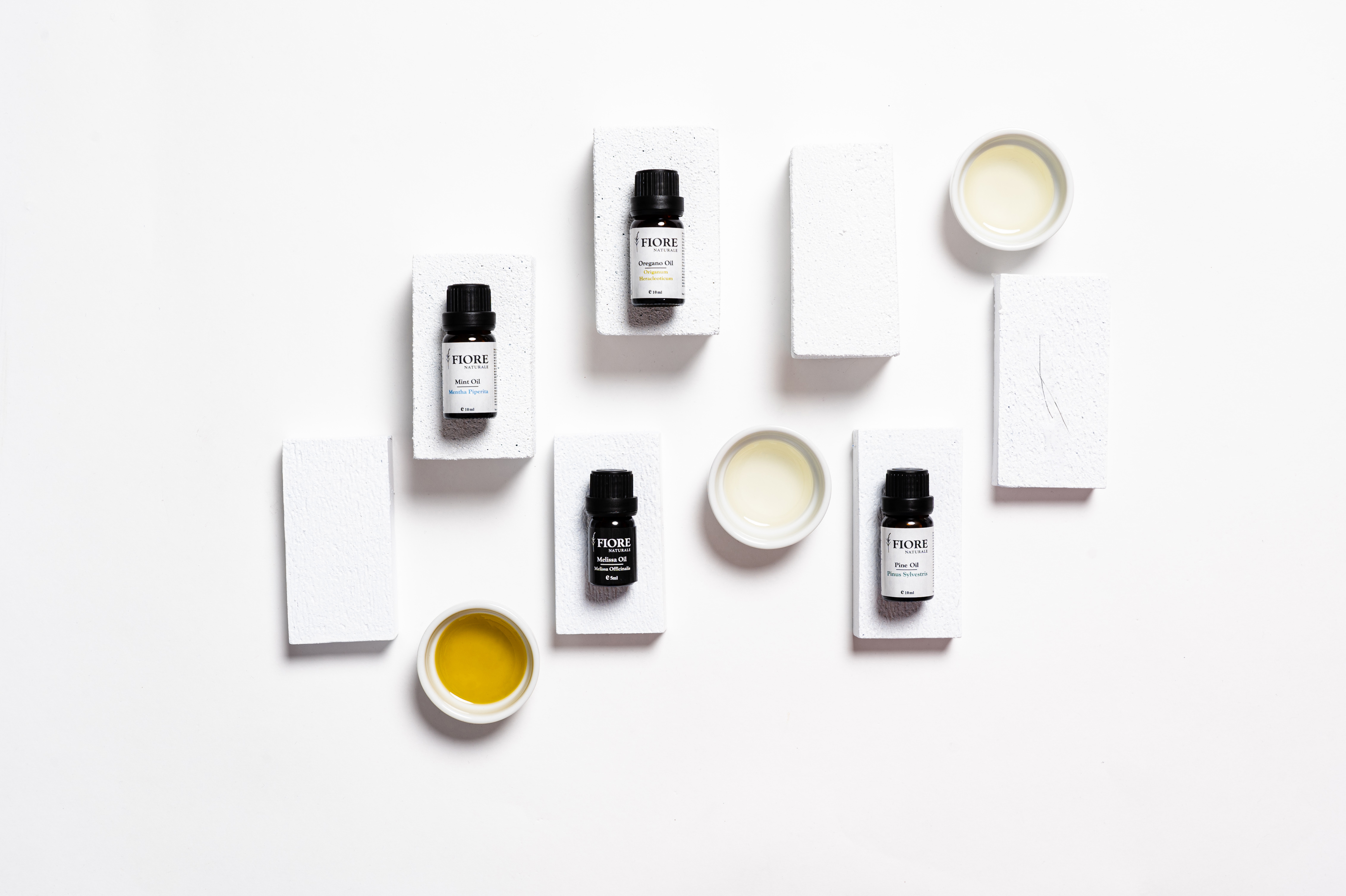
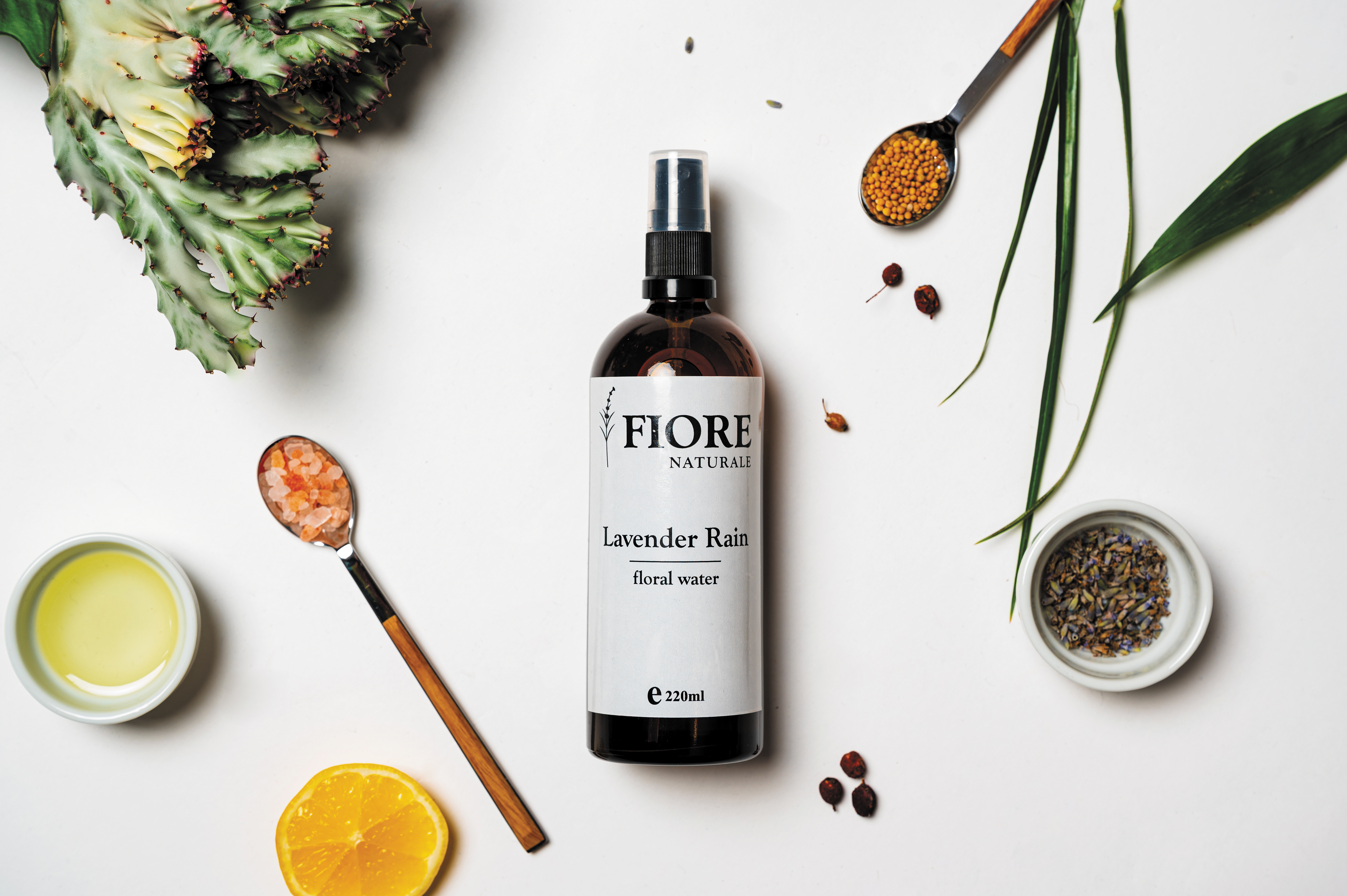
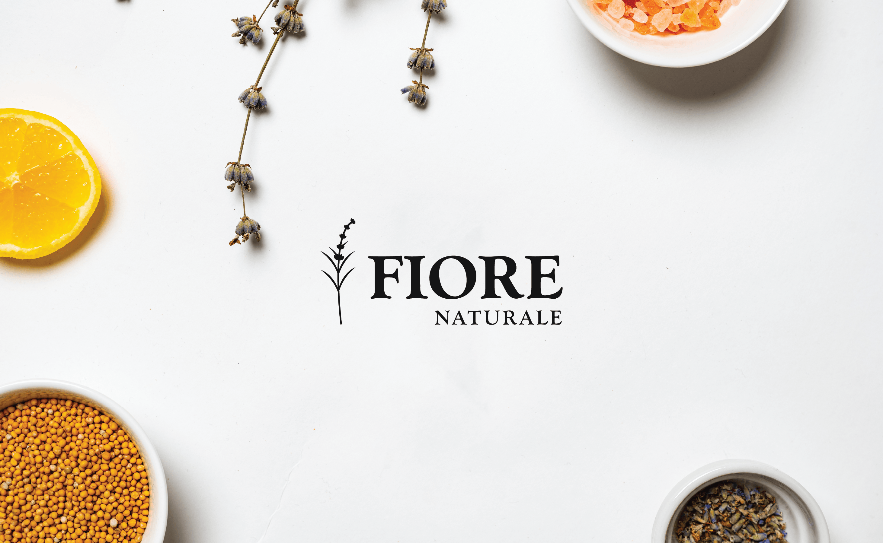
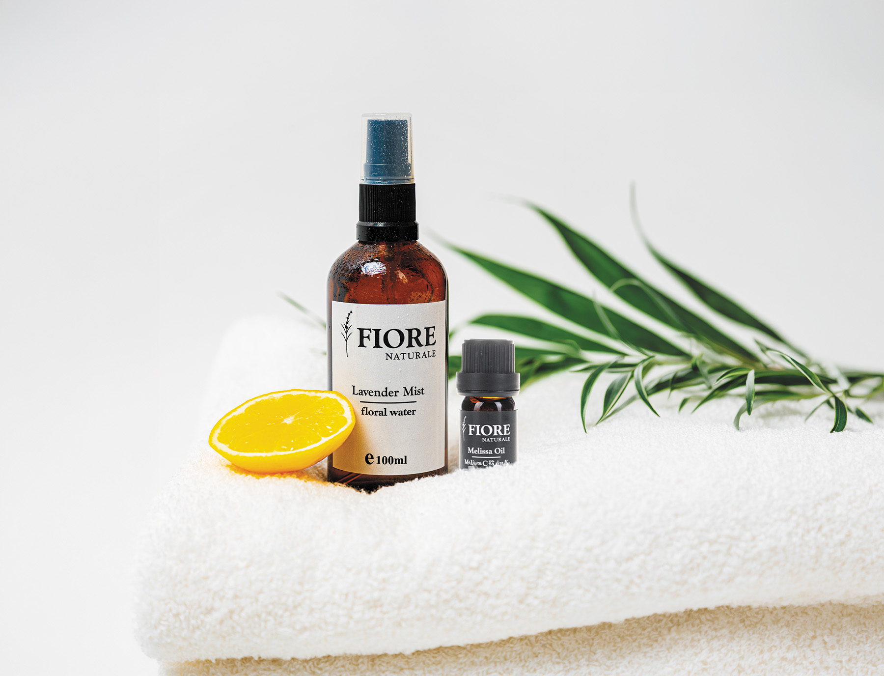
We developed a refined visual framework anchored by a botanical logo mark, a warm earth-tone palette, and clean typography. The result is an identity system that carries its elegance through white space rather than heavy ornament — paired with an intuitive web platform that lets the essential oils take center stage.
/ Visual Showcase
The
presentation.
/ Next Project
CASA DE LA LUGA
LOGO · 2026