
STASY PIERCING
An editorial voice cast in ink, paper and pace.
Role
Logo design & Print
Client
STASY PIERCING
Timeline
Jan — Feb 2026
Tools
Illustrator ·
/ Creative Process
The brief.
The solution.
01 — Context
The brief.
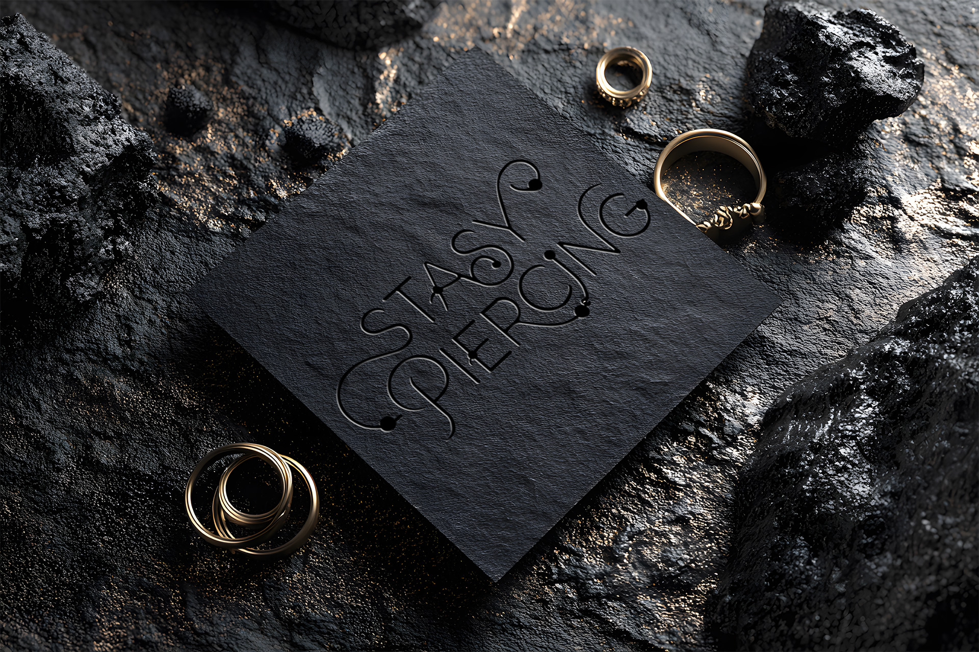
STASY PIERCING was growing an independent body art studio built on precision, hygiene, and personal aesthetic. While the craftsmanship was established, the brand lacked a defining mark and cohesive visual language to match its professional standards across digital and physical touchpoints.
02 — Strategy
The solution.
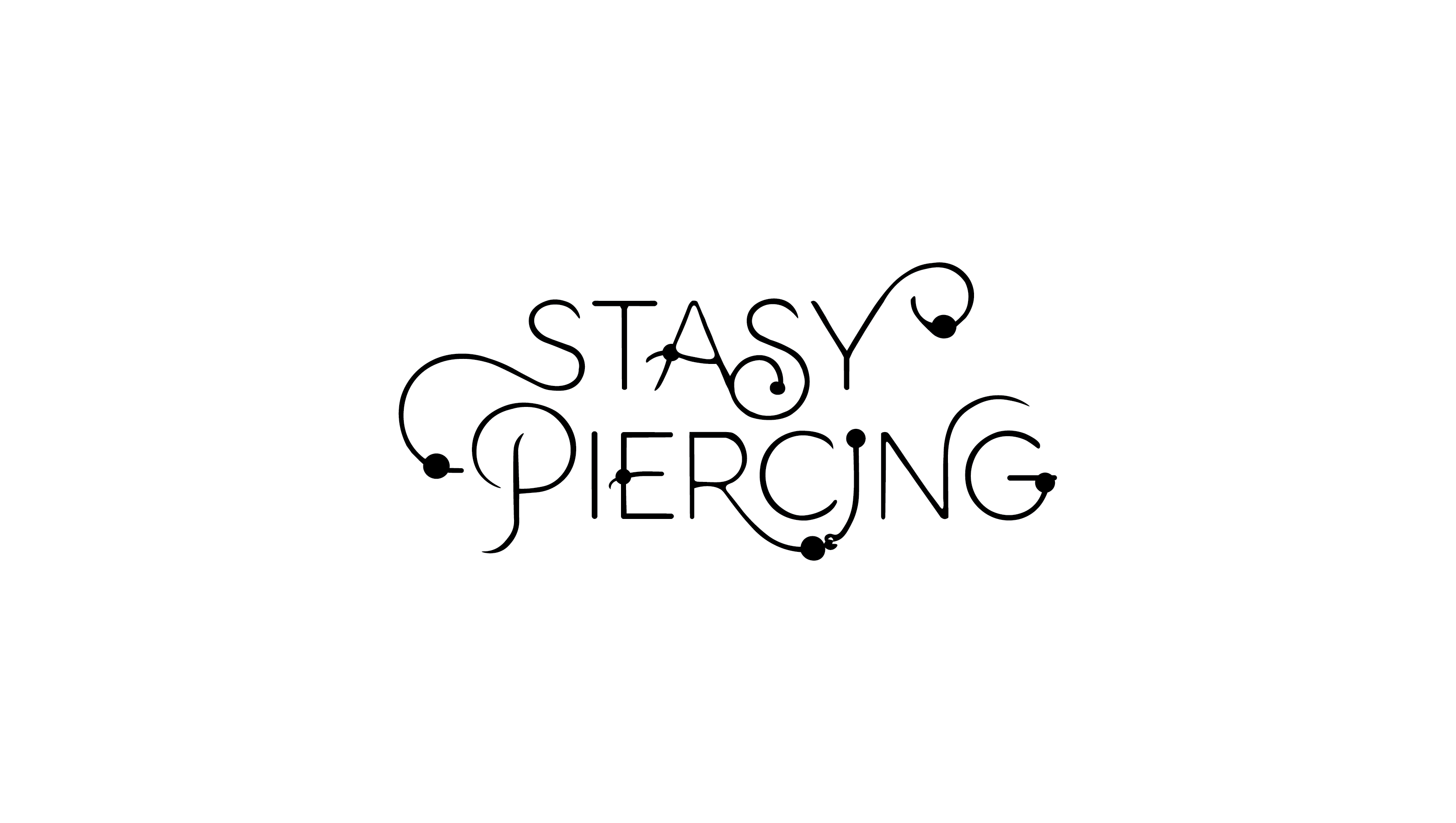
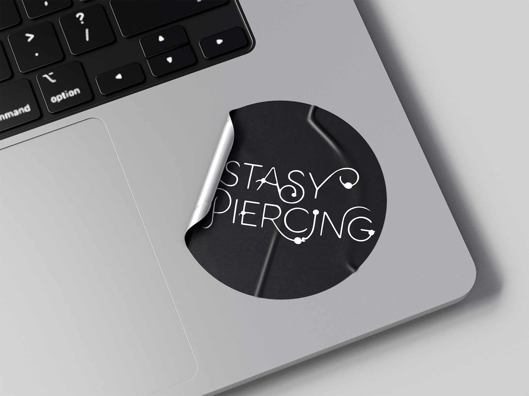
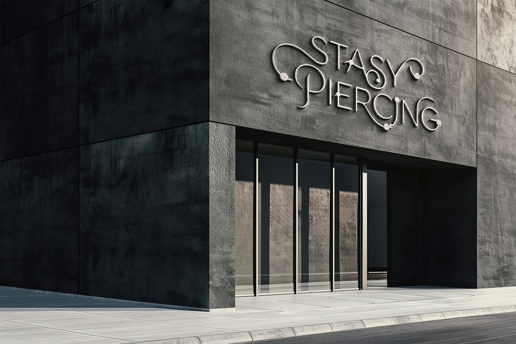
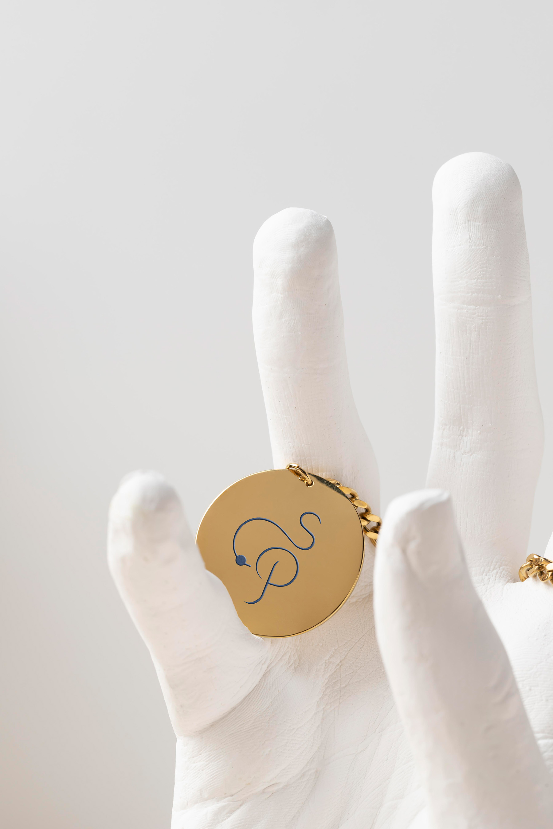
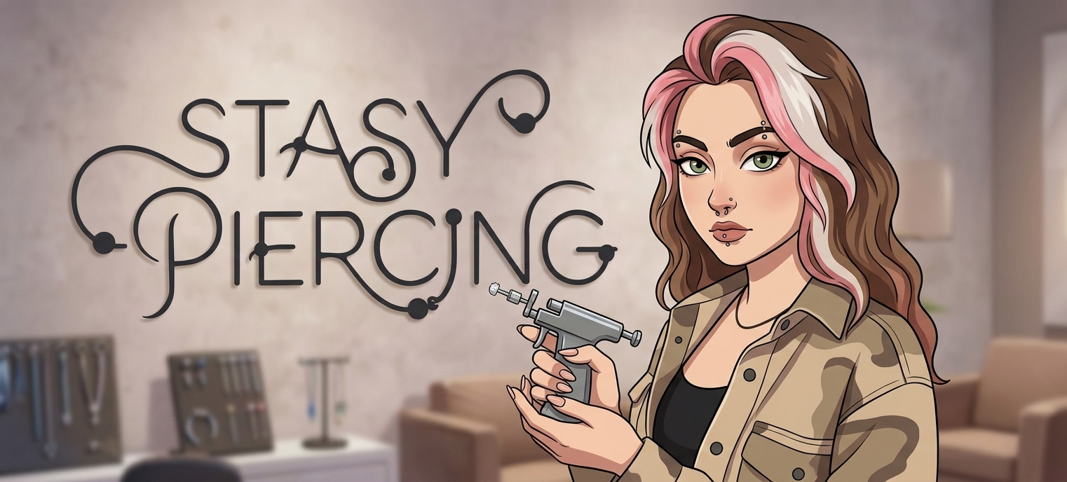
We built a versatile identity framework tailored to body art culture. Starting with a sleek, minimalist logo mark, we created a cohesive visual language that seamlessly translates across print collateral, client care guides, and digital platforms.
/ Visual Showcase
The
presentation.
/ Next Project
THE FOOD LAB
BRAND IDENTITY · 2024